
Blog
Best Colors for a Warm Undertone, With Outfit Formulas
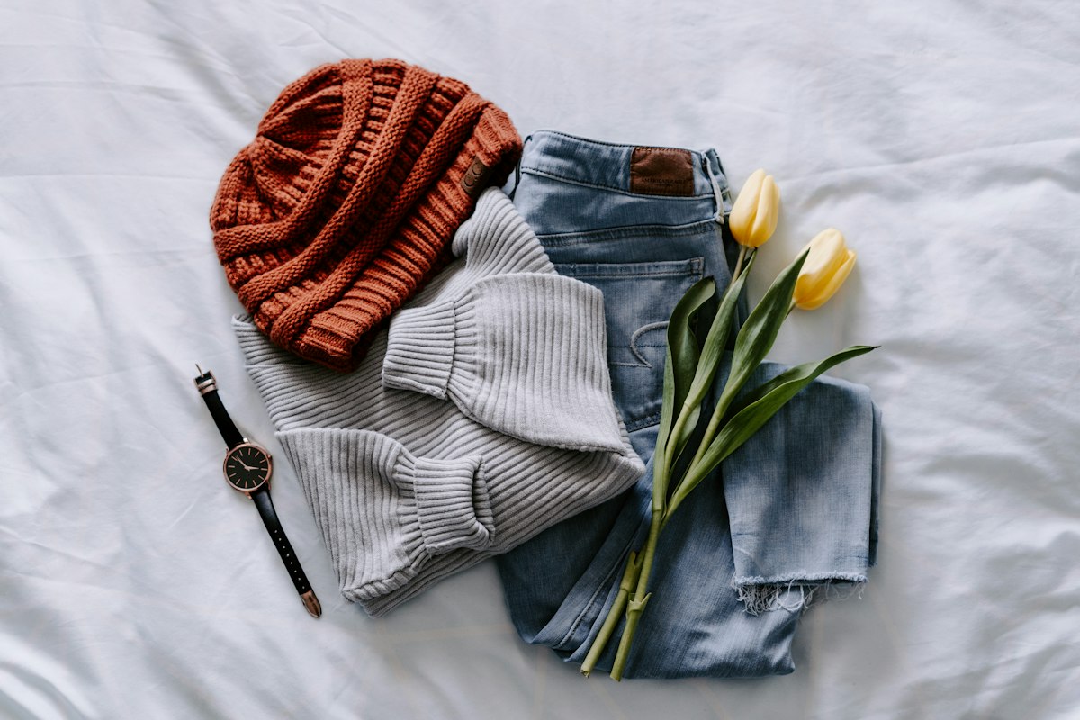
A warm undertone usually looks best in golden, earthy and peachy colours: cream, camel, chocolate, olive, coral and turquoise are reliable picks. Metals like yellow gold, copper and bronze tend to complete the look.
Not sure you are warm? Run the checks in how to find your skin undertone first.
Neutrals that work
These are the backbone of a warm wardrobe.
- Cream
- Camel
- Chocolate
- Olive green
Cream is often softer than stark white. Chocolate brown can replace black near the face.
Bright colours that glow
- Coral
- Tomato red
- Marigold
- Turquoise
These carry the same golden warmth as your skin, so they tend to make it look healthy and lively.

Colours to test with care
Some colours are harder on warm skin, not forbidden.
| Colour | Why it can be tricky | How to make it work |
|---|---|---|
| Ice blue | Cool and pale; can look washed out | Wear it away from the face, or try a warmer, softer blue |
| Pure white | High contrast; can look stark | Swap in cream or ivory near the face |
| Cool pink | Bluish pinks can look harsh | Try salmon or peach pink instead |
The point is to test, not to avoid. Hold the colour under your chin in daylight and trust what you see.
Metals
- Best: yellow gold, copper, bronze.
- Worth trying: rose gold, which is a warm pinkish metal and varies by person.
- Can work, but check: silver, especially if you pair it with a warm outfit.
Our guide to gold or silver jewelry shows a quick three-step test.
Three ready outfits
- Everyday: a cream sweater, camel trousers and brown loafers, with a gold chain.
- Smart: an olive shirt, chocolate trousers and a tan belt, with copper earrings.
- Statement: a coral top with cream trousers and a camel coat. Add a small gold pendant.
Each outfit pairs one neutral with one earthy partner and, if you like, one bright colour.
Patterns and textures
Warm palettes often look best in natural, tactile fabrics: wool, corduroy, linen and suede. For prints, look for earthy checks, botanical designs and warm stripes where the background is cream or camel rather than stark white. A rust and cream stripe, for example, reads as warm, while a black and white stripe is much higher in contrast.
Seasonal use
Warm palettes fit autumn especially well. The autumn colours by undertone guide takes these shades further, with an outfit formula for each undertone.
Common questions about warm undertones
Does warm mean yellow skin? Not exactly. Warm refers to the subtle golden or peachy tone beneath the surface. It can show up on any skin depth.
Does my undertone change with a tan? No. A tan changes your surface tone, not the undertone.
What if I am between warm and neutral? Many people are. You can wear a wider range, so use the warm palette as your anchor and experiment with softer neutrals. The neutral undertone guide explains that middle ground.
Where Kittyfit fits in
Kittyfit detects your undertone from a short quiz and optional face and wrist photos, analysed on your iPhone. The app then scores clothes and jewelry in your digital closet against the result. Virtual try-on is optional and asks for your approval first. See how it works.
Frequently asked questions
What colors look best on a warm undertone?
Creamy neutrals, camel, chocolate, olive, coral, tomato red and turquoise are strong starting points. They share the golden warmth of the skin.
Can warm undertones wear black or white?
Often yes, with a tweak. Try cream instead of stark white, and espresso or dark chocolate instead of black near the face.
Can I wear pink with a warm undertone?
Yes. Warm-leaning pinks such as salmon, peach and coral usually work better than cool, bluish pinks. Test them near your face.
Is silver jewelry off limits?
No. Yellow gold, copper and bronze tend to glow most, but wear what you like and see how it looks in daylight.
General style guidance based on common color-analysis practice, not medical or dermatological advice. Results vary with lighting, device and the individual.